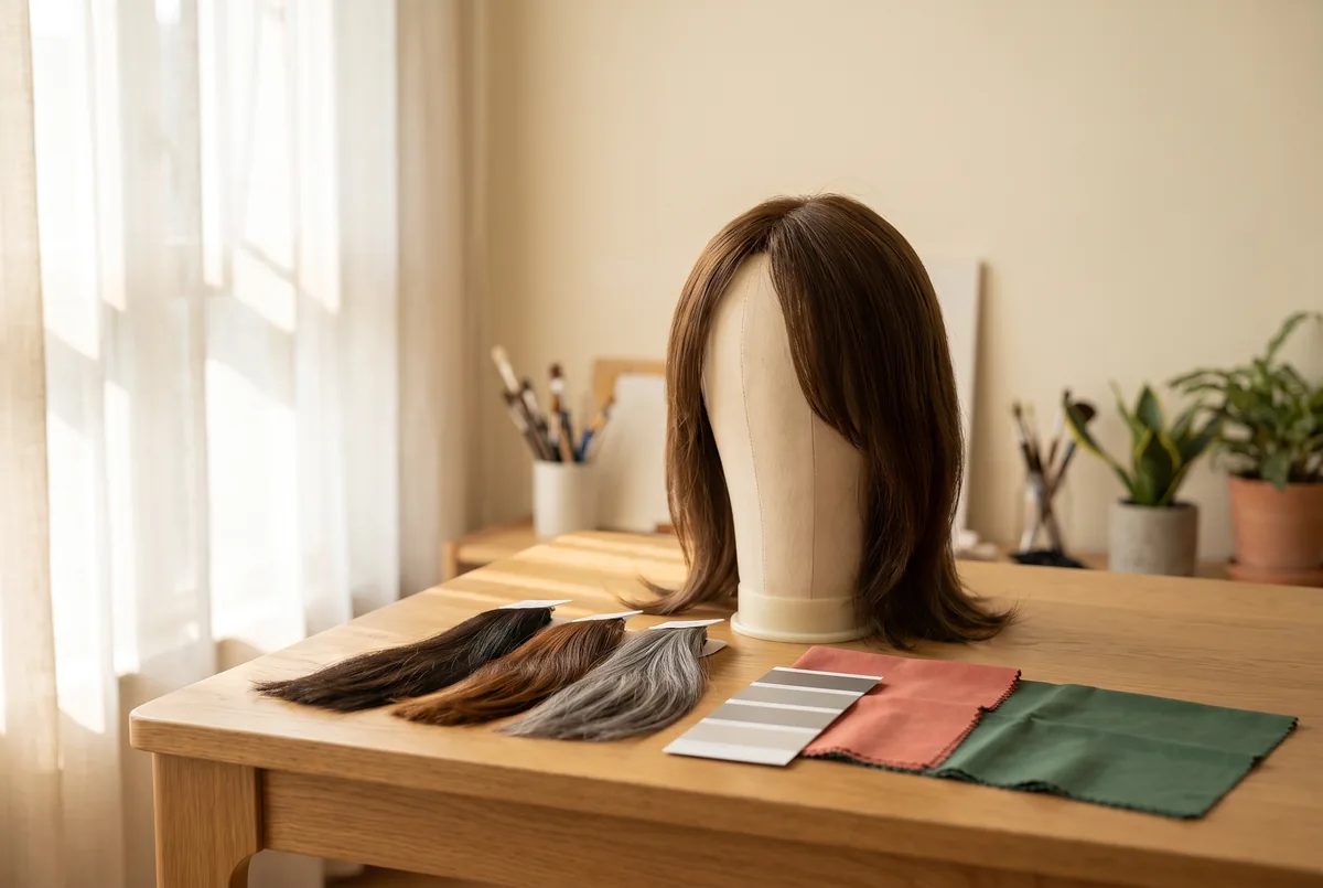
Brief a portrait colour direction by logging daylight, venue light, camera preview and wardrobe colour beside three reference swatches before anyone settles on a hair colour. The purpose is not to predict an exact match in every frame, but to make the next choice visible, comparable and ready for confirmation.
A useful brief treats colour as a conversation between subject, room, camera and final use. OwnStrand is an external retail website with the same owner as FlintHub Academy; its mentions here are disclosed service links, not independent recommendations or endorsements from a public or medical body. This article offers a planning method, not a product test, colour guarantee or medical opinion.
Start with the decision, not the colour name
“Black”, “brown” and “grey” are family labels, not complete visual instructions. Black can reflect blue under a cool LED; brown can take on copper from timber; grey can look silver against navy but muted against pale concrete. State the contrast, warmth and texture the portrait should communicate.
Write one sentence before gathering swatches. For example: “The subject should feel quietly formal, with a soft separation from the charcoal backdrop rather than a dramatic silhouette.” It gives the team a reason to reject a colour that is attractive alone but wrong for the image.
Use these three questions at the beginning:
- What must remain recognisable? This could be the subject’s usual depth, a deliberate salt-and-pepper transition, or a graphic dark outline.
- Where will the portrait be seen? A phone screen, an event projection, a printed programme and a social post can reveal different parts of the tonal range.
- What can be adjusted later? Background position and wardrobe may be flexible; the subject’s comfort, time and the actual light available may not be.
A colour brief is successful when it records enough context for a later viewer to understand why a swatch was preferred. It is not a promise that every monitor, camera profile or lighting change will reproduce it identically.
Build the four-light record before comparing three swatches
The worksheet has four observation fields and three reference swatches. Do the observations first, then place swatches in the same order in every note and preview. A plain white or neutral-grey card aids review; it is not a substitute for calibrated colour management.
| Brief field | Record on location | What it changes in the decision | Practical prompt |
|---|---|---|---|
| Daylight | Time, window direction, cloud or shade, distance from window | Reveals warmth or coolness and the hair’s highlight pattern | Does the chosen swatch still separate from the face near the window? |
| Venue light | Fixture type, position, colour of nearby walls and mixed sources | May create a colour cast or hard glare | Is the light part of the final portrait, or only a setup condition? |
| Camera preview | Camera or phone, preview setting, exposure choice and a reference frame | Shows the team’s immediate rendering, not the final file | Is a clipping warning, over-bright shine or flat shadow visible? |
| Wardrobe colour | Main garment, collar area, jewellery or scarf closest to the face | Alters perceived temperature and contrast at the portrait’s centre | Does the hair read as intentional beside the neckline? |
Choose a decision range, not three near-identical contenders: neutral black, softened black and deep brown; or charcoal, salt-and-pepper and light silver-grey. Label them A, B and C by position rather than a retailer’s photograph, so no webpage is assumed colour-accurate.
The American Cancer Society suggests comparing colour near a window, taking a reference photo of one’s usual style, and checking seller sizing and return conditions. These are prompts, not universal rules. 1
Choose a black, brown or grey direction by contrast behaviour
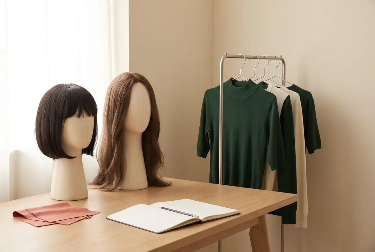
The colour family is a trade-off, not a hierarchy. Black can give a clean outline but conceal lowlight detail. Brown gives a gentler transition but can read orange near warm materials. Grey expresses texture, while light grey may lose edge definition in bright surroundings.
| Direction | Useful when the brief calls for | Watch for | Confirmation test before the session |
|---|---|---|---|
| Black | Defined contour, graphic tailoring, a deep frame around the face | Highlight glare, loss of strand detail and overly heavy contrast | Check the swatch beside the collar in both window light and the final venue light |
| Brown | Softer depth, warm or neutral styling, a less abrupt transition to a mid-tone background | Copper, red or yellow reflections from wood, fabric or warm lamps | Compare a neutral and a warm brown next to the actual wardrobe, not an online image alone |
| Grey | Visible texture, a deliberate salt-and-pepper story, restrained contrast with dark clothing | A washed-out edge in bright light or a blue/green cast under mixed LEDs | View against the background at the intended exposure and ask whether the outline is still readable |
For a portrait needing depth and a crisp outline, black wigs may help identify colour-family names; then use the actual item or a dependable reference in the four-light record. Web images are not a colour guarantee: screens, retouching, white balance and surroundings alter the result.
Brown is often misbriefed as “natural” when the need is low contrast, soft warmth or visible dimension. State the quality. If the portrait needs brown, brown wigs can be a category reference after the disclosure above, but confirm it against wardrobe and actual light. Dark brown may look beautiful against cream and almost black beside a black collar; that comparison is useful, not an error.
Run a short confirmation sequence on the day
A short sequence can reduce uncertainty without claiming to be a laboratory test. Keep the subject’s position and swatch order consistent. Prioritise the final portrait light over a more flattering setup light.
- Lay out A, B and C. Put the three swatches or labelled references on a neutral surface, with the wardrobe item nearest to the face beside them.
- Observe by the window. Take one still record in indirect daylight. Avoid making a decision from direct sun alone, as a strong highlight can mask the underlying tone.
- Move to the venue position. Photograph the same layout where the portrait will actually happen. Note any mixed window, ceiling, decorative or coloured light.
- Make one camera preview. Frame the references with a small part of the background and wardrobe. Record exposure or profile changes that materially alter the preview.
- Check face-adjacent contrast. Hold the preferred option close to the collar and, where appropriate and comfortable, near the face. Look for unwanted casting, glare or a disappearing edge.
- Name the provisional choice and a fallback. Write “B preferred in venue light; A fallback if window light dominates.” This preserves a decision route if conditions change.
- Ask for confirmation. The wearer or creative lead confirms the direction. A request for confirmation is more honest than declaring a match exact.
A Photography workshop can provide a structured setting to practise reading light, framing and camera preview as connected choices. It does not turn a preview into a colour guarantee, and it should not be presented as a wig-fitting or medical service.
Use the worksheet: one page, three swatches, two decisions
Copy this into a call sheet, notes app or printed page. “Unknown” is valid; recording an unconfirmed lighting specification is better than guessing it.
Portrait colour brief — reusable worksheet
Portrait purpose: ______
Desired visual reading (one sentence): ______
Daylight: time __ / window direction _ / shade or cloud
Venue light: source / position / mixed light or wall colour
Camera preview: device / exposure or profile note / frame saved
Wardrobe nearest face: colour / sheen or texture
Swatch A: family / warm–neutral–cool / response in venue light
Swatch B: family / warm–neutral–cool / response in venue light
Swatch C: family / warm–neutral–cool / response in venue light
Preferred direction: because _____
Fallback direction: _ if _____
Confirmation by / time: ____
The worksheet produces two decisions: the swatch that supports the desired reading under the key light, and the fallback if conditions change. Separating them prevents an unrecorded last-minute guess.
A grey reference suits a brief focused on texture over dark outline. grey wigs may help identify a range, but cannot establish how a particular grey appears in an unfamiliar venue. Confirm the specific colour, construction and written terms with the seller.
Plan wardrobe and background as colour partners
The collar and shoulder area share hair’s visual zone, so their hue, brightness and sheen change the balance. Cream can make neutral grey seem cooler; glossy black can compete with black hair; saturated green may magnify a red or yellow cast in brown.
Make one deliberate pairing choice rather than changing every variable at once:
- Pair black with matte mid-tone or controlled dark surroundings to retain outline without reflected glare.
- Pair brown with a neutral or deliberate warm garment; test strong orange, red or yellow walls before calling it neutral.
- Give grey an edge to read: a very pale top and bright background can merge with light silver.
- Keep shiny jewellery or metallic fabric out of the first comparison frame; their highlights distract from hair colour.
A Creative workshop may help practise how palette, texture and focal point work together. It does not supply portrait styling, wigs or colour-matching outcomes.
Diagnose common mismatches instead of chasing a perfect swatch
Most mismatches are context problems. Name the symptom and change one variable at a time. The aim is a defensible direction, not a promise that every light and display agrees.
| Symptom in the preview | Likely context to check first | Limited, practical response |
|---|---|---|
| A dark direction reads as one flat block | Exposure, shiny overhead light or a background too close in value | Shift the subject or light angle, test a softened dark reference, and retain strand detail where the brief needs it |
| Brown looks unexpectedly orange or red | Warm walls, timber, amber fixtures or a warm wardrobe | Make a neutral comparison under the venue light; do not judge only under window light |
| Grey looks blue, green or dull | Mixed LEDs, reflected wall colour, automatic white balance | Record the dominant source, take a stable preview and ask whether the cast is acceptable to the intended image |
| The colour works near a window but fails on set | The decision was made under a light that will not be used | Prioritise the final portrait location and keep the earlier window view as a useful contrast record |
| The wearer dislikes the result despite technical consistency | The brief omitted personal preference or comfort | Pause the visual decision, ask what feels wrong, and choose only with their confirmation |
With scalp sensitivity, treatment or possible adhesive use, do not infer suitability from a colour record. The American Cancer Society says these choices are personal and advises discussing wig concerns with the relevant health-care team during treatment. 1 A wig or hairpiece is an appearance item, not a treatment; comfort, lack of sensitivity and health outcomes cannot be promised.
Treat material and styling limits as part of the brief
Include material limits because shine, curl and texture influence the camera. Before heat styling, colouring, bleaching, adhesive use or extensive brushing, check the exact product guidance and seek qualified advice where appropriate. A colour family does not indicate fibre, cap construction or styling tolerance.
Jon Renau’s care guidance distinguishes human hair, standard synthetic fibre and heat-resistant synthetic fibre. For that manufacturer’s standard synthetic fibre guidance, heat styling and blow-drying are not advised; it also advises suitable care products, avoiding rubbing and storing the cap only once fully dry. Those are manufacturer-specific care conditions, not a rule for every wig or hairpiece. 2
This matters visually: changing texture or tone can alter sheen, durability or fit. Record the desired look and conditions needing confirmation; do not promise that heat, dyes, adhesives, availability, price, wear duration or returns will deliver a particular result. Hong Kong Customs says the Trade Descriptions Ordinance prohibits false trade descriptions; use clear product information and confirm written terms. 3
A hypothetical planning example, not a client result
This fictional planning scenario shows the framework. It is not a client, testimonial, survey or performance claim.
A speaker is photographed for an evening programme with cool ceiling LEDs, a walnut lectern and navy jacket. The brief is: “Calm authority with visible texture; the hair should not collapse into the lectern or become a bright focal point.” The team records cloudy window light, then the stage position. A medium salt-and-pepper reference stays textured under LEDs; dark brown takes warmth from the lectern, while near-black loses separation against the jacket.
The provisional choice is salt-and-pepper, with dark brown as fallback only if front lighting warms. The record says, “Confirm wearer preference after stage preview; no promise of exact reproduction in print.” It makes clear what the comparison did—and did not—establish.
Finish with a confirmation note everyone can understand
Before the portrait begins, read the brief aloud in plain language: the chosen direction, the light that matters most, the wardrobe pairing, the fallback and the person who confirms. A concise note might be: “B is preferred for the cool stage light and navy jacket; it keeps texture visible. Recheck if the front lights warm up. The wearer confirms this direction, not an exact colour match across every image.”
This approach makes black, brown and grey decisions more deliberate without overstating precision. The swatches provide a shared reference; the four-light record provides context; and confirmation leaves room for the wearer’s judgement. That combination is more useful than a label alone, especially when a portrait must work across changing environments and outputs.
By FlintHub Academy · AI-assisted editorial
About the author: FlintHub Academy provides creative-learning planning information. This is AI-assisted editorial work, not personal testing or a wig-fitting, dermatology, medical or treatment service.
References
FlintHub Academy · AI-assisted editorial. FlintHub publishes creative-learning and event-planning information. This article is a desk-researched planning resource, not a first-hand product test or a claim of wig-fitting or medical qualifications.