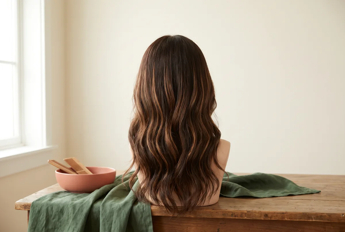
Judge short-hair highlights at the image size readers will actually see, not only in a close-up reference. Use a crop-scale worksheet to compare line width, darker gaps and contrast across a thumbnail, headshot and poster before requesting a hair change.
A fine accent may look distinct in a large portrait yet become a soft tonal blend in a small image. That can be a successful editorial choice. The question is whether the crop communicates your intended shape and emphasis, not whether every highlighted strand remains individually visible.
1. Start with the final publication size
Write down the destination before choosing a reference. An adult learner preparing an editorial portrait in Hong Kong might need a small event listing, a speaker headshot and a poster for the same project. These outputs can use one photograph, but they do not give hair detail equal space.
Record the displayed image dimensions and how much of the frame the head occupies. A wide poster with a small portrait can show less hair detail than a compact headshot. For print, include the physical portrait size and intended viewing distance. The overall page dimensions alone are not enough.
| Output | What to inspect at its intended size | Useful success criterion |
|---|---|---|
| Thumbnail or event listing | Overall silhouette and one readable light–dark area | The head separates from the background without needing individual lines |
| Editorial headshot | Fringe direction, visible side and darker gaps | Accents support the face and remain coherent around the cut |
| Poster portrait | Detail at close range and shape at viewing distance | Colour does not compete with the expression or nearby headline |
Choose one priority output if the requirements conflict. A subtle headshot and a dramatic small promotional image may need different crops rather than one intensified colour plan. Discuss layout alongside imagery; the Photography and image workshop is a relevant FlintHub starting point for readers considering photography learning, not a promise of hair services.
2. Separate width, density and contrast
Line width is the apparent thickness of a bright accent. Density is how closely those accents are distributed. Contrast is the difference between an accent and its surrounding hair. These variables interact, but they are not interchangeable: a narrow, pale line against dark hair can attract more attention than a wider line close to the base tone.
When the image becomes smaller, closely spaced lines may merge into a lighter region. Increasing density could therefore make the hair look brighter without making individual strands easier to distinguish. Keeping visible darker gaps may preserve the rhythm you wanted, while accepting a blended appearance may better suit a restrained portrait.
For a service discussion, the Vit So page labelled hair highlights provides vocabulary for strand width, contrast and retained depth. Use your worksheet to distinguish “I want readable accents” from “I want the whole top to look lighter.” The page cannot establish how either aim will reproduce in your final crop, and the appropriate products, coverage and achievable brightness need assessment of the actual hair.
The label babylights is useful when discussing very fine strands, but it is not an image-resolution specification. Bring both the large reference and the small intended crop, and identify whether you like the individual lines or their blended impression. Fine-looking work does not by itself establish bleach-free processing, low upkeep or suitability for your hair history.
3. Read the short silhouette before the colour
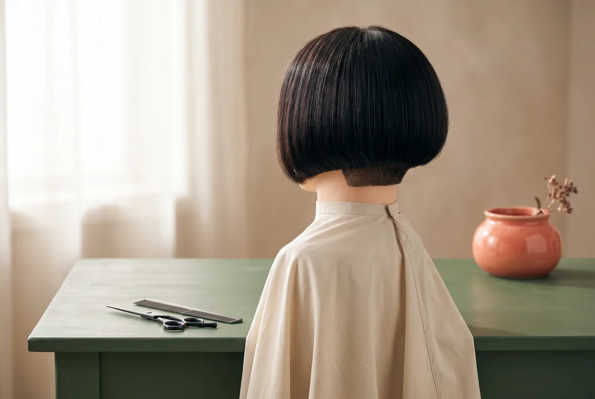
A short cut gives every visible bright area a particular relationship to the outline. A strand beside an ear-length fringe occupies a different proportion from a strand running through a longer bob. Inspect the crown, front lengths and end line separately rather than treating all short hair as a reduced version of a long-haired reference.
Mark the hair you want to retain after the next trim. If most of a preferred accent lies on ends you intend to remove, that reference describes the wrong working length. An ear tuck can also conceal front brightness or expose a different section. Include your usual parting and glasses where relevant.
The guide to highlights for short hair helps frame this cut-and-colour discussion around retained length, darker areas and everyday positioning. Translate a reference into a request such as “keep the lower bob edge predominantly dark, with some brightness on the visible side.” This is a visual aim for discussion, not confirmation of a technique, a reproducible finish or which service should happen first.
Keep composition separate from cutting. Cropping the photograph above a bob edge removes that edge from the reader’s view; it does not mean the haircut itself needs shortening.
4. Make a controlled crop comparison
Use a recent, unfiltered photograph of your current hair or an appropriately licensed reference. Label whose hair it shows. If your current hair has no highlights, the photograph can still help you judge silhouette, but it cannot predict a future colour result. A marked-up illustration should remain visibly labelled as a concept.
First, save a master image with the whole intended outline visible. Make separate copies for each output so that editing a thumbnail does not overwrite the headshot. Record the crop and export size beside each copy.
Second, view each export at its intended display size, without zooming in to rescue detail. For a poster, inspect a layout proof close up and from the planned viewing distance. Ask whether you notice a distinct accent, a blended lighter area or no meaningful colour separation.
Third, change one photographic variable at a time. Compare a tighter crop while keeping the source image unchanged, then compare a different background or light arrangement in a separate version. Changing the crop, exposure and sharpening together makes it difficult to explain what helped.
Finally, inspect the delivered file, not just the editing preview. Compression and resizing can change small details. Check that any sharpening does not create pale outlines along the hair edge. Stop when the image meets its stated purpose rather than pursuing maximum texture at every scale.
Keep this exercise low-manipulation. The American Academy of Dermatology recommends gentle handling, less frequent heated styling and the lowest heat setting when heat is used.1 Repeatedly resetting the hair with hot tools is not necessary to compare exports from one photograph.
5. Fill in a hypothetical crop-scale worksheet
Hypothetical teaching example: an adult learner is preparing one portrait for a Hong Kong community music programme. The example uses a drawn short bob, not a real client, a salon portfolio image or a tested colour outcome. The learner wants the dark outline to remain recognisable while lighter accents give the visible side some separation.
Assume one drawn accent appears six pixels wide in a 1,200-pixel-wide crop. With the crop unchanged, proportional resizing makes it approximately two pixels wide at 400 pixels and 0.8 pixels at 160 pixels. These are illustration dimensions, not recommended hair-section widths. They explain why a line can become difficult to distinguish; they do not establish a universal legibility threshold.
| Worksheet field | Hypothetical entry | Decision to carry forward |
|---|---|---|
| Priority output | A 400-pixel headshot; a 160-pixel listing is secondary | Preserve the headshot’s restrained appearance |
| Line width | Fine accents in the drawn reference | Judge the exported appearance, not a service name |
| Density and dark gaps | Several accents beside clearly dark areas | Avoid making the whole side uniformly light in the concept |
| Contrast within the hair | Warm accents against a dark base | Compare tonal separation without prescribing a formula |
| Background contrast | Dark hair approaches a dark background in one layout | Try a lighter background before changing the hair aim |
| Short-cut boundary | Dark lower edge and usual ear tuck are retained | Include loose and tucked views in the brief |
For this example, the intended thumbnail result is a readable silhouette and a modest lighter region, not a row of countable strands. If that aim is met, losing individual lines is acceptable. If the head disappears into the background, the next step is a composition comparison rather than automatically requesting more lightening.
6. Decide what to change—and what to leave alone
Use the worksheet to locate the failure. If fine lines disappear but the head remains clear and the expression leads, there may be nothing to fix. Detail loss matters only when that detail was part of the communication goal.
If the whole hairstyle merges with the background, try changing the background or light direction. If a bright patch dominates the face, compare the crop or camera angle before proposing lower density. Photographic adjustments can alter the balance without altering the hair, although they may not suit every layout or capture session.
A tighter crop makes hair occupy more of the frame, but reduces space for shoulders, clothing and text. A larger portrait allocation can reveal more detail on a poster, but competes with programme information. Greater contrast can make an accent more noticeable, yet may undermine the soft appearance that attracted you to the reference.
For a music promotion, check the portrait alongside the performer name and event details. Readers exploring Live-band performance planning can use that context to think about the wider performance brief. The link does not imply a combined hair-and-music package. Agree who owns the final layout so that a late portrait reduction does not silently change the visual requirement.
Where one image cannot serve every output, preserve a common visual identity through two approved crops. Consistency does not require identical framing.
7. Turn the worksheet into a usable brief
Send a small set of clearly labelled images: the current front and side views, one reference with the desired feature marked, and the priority publication crop. State the cut length you plan to keep, your normal parting and whether the reference’s overall brightness is desirable. Ask what is achievable rather than asking for an exact copy.
Separate decisions by responsibility. The photographer or designer determines framing, image treatment and export settings. A hair professional assesses the proposed cut or colour work against current condition and treatment history. The worksheet connects their conversations; it does not replace either assessment.
Avoid scheduling extra processing merely because the thumbnail hides a fine line. FDA guidance says to follow the actual dye’s directions and notes that reactions can occur after previous uneventful use; a preliminary skin test does not eliminate that possibility.2 Mention prior reactions and chemical treatments before considering colour. An irritated scalp or a reaction calls for appropriate healthcare advice, not a diagnosis from an image worksheet. This US source supplies safety information, not Hong Kong regulation or brand approval.
Confirm scope and appointment arrangements separately. If considering Vit So, its stated reception address is 252 Hollywood Road, Sheung Wan; do not assume another branch or walk-in availability. An English website also does not establish English-language consultation, so confirm communication needs before arranging a visit.
FAQ
Must fine highlighted lines survive in every thumbnail?
No. A blended lighter area can be appropriate when the thumbnail’s purpose is recognition. Require separate lines only if they are essential to the editorial idea; otherwise prioritise the face and overall shape.
Can I enlarge a small reference to judge a poster?
Enlargement does not recover missing detail. Use a sufficiently detailed source and inspect the portrait at its planned physical size. A large poster title does not mean the portrait itself will be large.
Would broader highlights solve a visibility problem?
Not necessarily. Wider accents can occupy a substantial part of a short silhouette and compete with the face. First check crop scale, darker gaps, background separation and whether distinct lines are actually needed.
Should I request colour before deciding on the short cut?
Explain both aims together, including the next trim and normal ear tuck. The appropriate sequence depends on the agreed work. The worksheet identifies which visible lengths matter; it does not prescribe a universal service order.
Is a digital highlight mock-up evidence of a possible result?
No. A labelled mock-up can communicate placement and visual emphasis, but cannot establish achievable lift, processing suitability or maintenance. Keep it separate from current-hair photographs and any genuine portfolio material.
What if the headshot works but the event listing does not?
Try an output-specific crop or background treatment while preserving recognisable shape. If it still fails, revisit the listing’s portrait space with the designer before considering a hair change for a secondary format.
About the author: FlintHub Academy prepared this article with AI-assisted institutional editorial organisation for adult creative learners. FlintHub Academy and Vit So share common ownership. This is not independent endorsement, a hairstylist-authored review or medical advice. The planned illustrations are editorial concepts, not Vit So work or client results.
References
- [1] American Academy of Dermatology: 10 hair care habits that can damage your hair
- [2] U.S. Food and Drug Administration: Hair Dyes
FlintHub Academy · AI-assisted editorial prepared from public information. FlintHub publishes creative-learning and activity-planning resources. This is not a first-hand salon test, a real client case or a claim of hairdressing, clinical or medical credentials.