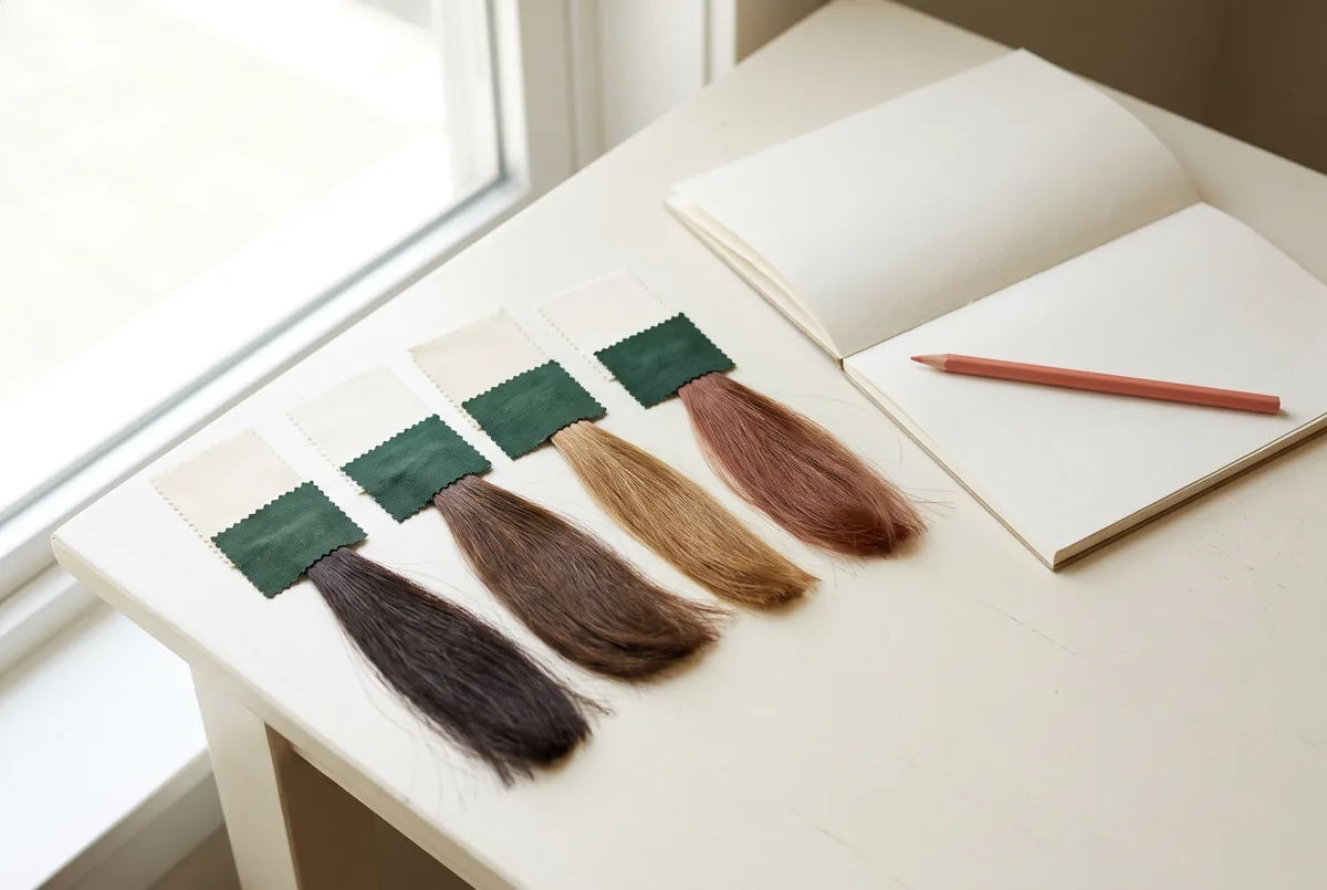
Compare warm and cool brown hair references only after checking their lighting, white balance, exposure and background. Use a recorded comparison setup and a reference-quality scorecard to decide whether you prefer a hair-colour change or simply a different photographic treatment.
For adult musicians preparing a band biography, booking profile or concert poster, the distinction matters. An amber rehearsal-room lamp can make brown hair look coppery, while a cool edit can make another reference look smoky. Choosing between those pictures without checking their conditions can turn a lighting preference into an unnecessary colour request.
1. Separate brown depth from warm or cool reflection
Start with two questions: how dark should the hair remain, and what reflection do you enjoy when light reaches it? Depth is the overall light-or-dark impression. Reflection is the reddish, golden or cooler-looking colour visible across illuminated strands. A dark warm brown and a lighter cool brown differ in both, so they do not isolate your preference for warmth.
Look at the roots, a shaded section and a broad mid-length area rather than only a glossy highlight. Bright shine can obscure colour detail. If only the lit edge looks golden, do not describe the whole head as light golden brown. Write a preference such as “retain a deep brunette base, with gentle warmth rather than obvious red.”
The guide to chocolate brown hair is useful for distinguishing brunette depth from red or golden reflections. Use its vocabulary to annotate your references, not as a calibrated swatch or evidence that your current hair can reproduce a photographed finish. Keep the darkest areas and the warmer areas marked separately so the provider can see which feature matters.
A stage identity need not dictate an everyday chemical change. If your promotional portrait must match a specific costume or lighting concept, record that requirement separately from the colour you want while travelling, working or rehearsing.
2. Record a comparison setup you can repeat
Create a baseline photograph of your current hair before interpreting inspiration pictures. Choose one dominant light source, a plain background and a repeatable position. Soft window light with nearby coloured lamps switched off is a practical starting point, but daylight changes; record the time and conditions rather than calling it perfectly neutral.
Keep the camera distance, head angle and hair arrangement consistent. Include an appropriate photographic grey card in one frame, positioned in the same light as the hair. A grey-looking wall is not a substitute. If you do not have a card, mark that limitation instead of claiming the picture is colour accurate.
| Lighting and image-condition record | What to write down | Why it matters |
|---|---|---|
| Main and secondary light | Window, lamp or stage fixture; which sources were on | Mixed sources can affect different hair areas differently |
| White balance | Fixed setting, custom setting or automatic; record unknowns | Camera interpretation can change warmth between frames |
| Exposure | Same manual settings, or locked exposure where supported | A brighter frame can hide depth and exaggerate pale areas |
| Background and clothing | Wall or backdrop colour; actual jacket or top | Contrast and reflected colour can affect the impression |
| File and viewing conditions | Original or screenshot; edits; same display and settings | Unrecorded processing and screen settings weaken comparison |
Use FlintHub’s Photography and image workshop as the relevant educational route for exploring camera and image-making decisions. The photographic brief should identify what the camera operator controls. It should not ask a colour provider to compensate chemically for an avoidable camera-setting problem.

3. Check white balance and exposure independently
White balance adjusts how the camera interprets the colour of illumination. Automatic white balance can change between frames when clothing, framing or the background changes. For a comparison session, keep the setting fixed within each lighting setup, or have the photographer establish a suitable custom setting. Record any adjustment made when changing light sources.
One white-balance correction cannot necessarily neutralise a window-lit side and an amber-lamp-lit side simultaneously. Reduce the mixed light for the baseline rather than repeatedly shifting the whole image until one section looks pleasing. Keep the mixed-light frame as a separate performance-context view.
Next inspect exposure without changing white balance. If bright hair areas have lost visible detail, the frame is poor evidence of shade. If shadowed lengths disappear into the background, it is poor evidence of depth. Adjust the photographic setup and repeat the baseline; do not infer that bleaching or darker colour is needed from either failure.
The guide to ash brown hair colour helps distinguish a cooler reflection from a paler overall target. Bring that distinction into the comparison: a less reddish deep brown is not the same request as light silver-brown lengths. An attractive cool screenshot cannot establish the original exposure, editing history or preparation needed on your hair.
Keep an untouched file alongside any edited preview. A warmer and cooler version of one photograph can clarify your taste, but label both as photographic simulations. Neither is a reliable forecast of a chemical result.
4. Test background and wardrobe after the baseline
A brown hair reference against a blue backdrop can feel different from the same reference against an orange backdrop. Nearby coloured surfaces may also reflect light onto the hair. First compare against the plain baseline, then introduce your intended jacket and backdrop while keeping the light and camera settings unchanged.
Ask whether the problem is unwanted red reflection or weak separation from the background. Those require different discussions. Dark hair merging into a black band jacket may call for a lighting or composition adjustment, not lighter hair. Conversely, a disliked warm reflection that remains visible across comparable views is a clearer preference to take into consultation.
Hong Kong musicians may need one portrait for both a small indoor performance poster and an online booking profile. A rehearsal space with a window and overhead lamps offers a different context from a controlled portrait setup. Use FlintHub’s Live-band performance planning to connect the image brief with the performance context. Decide which portrait is the general-purpose identity image and which is deliberately styled for a particular show.
5. Use a scorecard without pretending it measures colour
The reference-quality scorecard is an editorial worksheet, not a validated colour measurement. Give each image condition a score of 0 when unknown or visibly compromised, 1 when partly recorded, and 2 when recorded and suitable for the comparison. Score lighting and white balance, exposure, background, angle and hair arrangement, and file provenance. The maximum is 10.
Do not let the total override a critical weakness. If white balance, exposure or background scores 0, use the picture for inspiration only, not for a confident warm-versus-cool judgement. Even a high score describes evidence quality, not the suitability of a colour process. Uncalibrated screens remain a limitation.
Hypothetical worksheet: an adult guitarist wants a deep brunette headshot with less visible red. Reference A is an amber rehearsal screenshot; B is a cool-toned social screenshot. Neither has known camera settings. The guitarist then records current hair under one soft light and makes two labelled edits of that same baseline to explain the preferred direction.
| Warm/cool preference and unknown hair factors | Hypothetical observation | Decision or question |
|---|---|---|
| Reference A: warm screenshot | Lighting/WB 0, exposure 1, background 0, arrangement 1, provenance 0: 2/10 | Keep only as an example of warmth to avoid |
| Reference B: cool screenshot | Lighting/WB 0, exposure 1, background 1, arrangement 1, provenance 0: 3/10 | Do not conclude that its pale ends are essential |
| Recorded current-hair baseline | All five conditions recorded and suitable: 10/10 within this worksheet | Use as the starting record, not a salon prediction |
| Two edited baseline previews | Cooler reflection preferred at similar apparent depth | Label as simulations; preserve the original file |
| Existing hair and upkeep | Old dark dye on lengths; no-bleach preference; frequent rehearsal washing | Provider must assess feasibility and acceptable compromises |
The useful outcome is not “cool wins.” It is “keep brunette depth; discuss less red; pale ends are optional.” That remains actionable even when both inspiration images are unreliable.
6. Give the colour provider what photographs cannot establish
Prepare a short history of roots, mid-lengths and ends. Include salon and home dye, lightening, henna or plant-labelled colour, perms and straightening, with approximate dates and treated areas. Record uncertainty honestly. Mention visible breakage, tangling and whether preserving length matters more than matching the reference.
The provider must assess the starting colour, previously processed areas, hair condition, desired coverage and whether the preferred depth and reflection are feasible together. Ask what any proposed lightening or tonal adjustment is intended to achieve. A photograph cannot establish the necessary products, number of stages or an individual quotation.
For local enquiries, the hair colour sheung wan page describes the colour-service discussion and the information to share. Vit So’s single reception address is 252 Hollywood Road, Sheung Wan, Hong Kong. Confirm the proposed work, appointment availability, quotation and consultation language before travelling; an English website does not prove that an English consultation is available.
Keep reaction history separate from aesthetic preferences. The US FDA explains that a reaction can occur after previous trouble-free dye use and that a negative preliminary skin test does not eliminate reaction risk. Follow the actual product instructions and ask which precautions apply before booking. Current irritation or a previous reaction warrants appropriate healthcare advice, not diagnosis from a reference photograph. 1
Ask about upkeep for the proposed work and your rehearsal routine. The American Academy of Dermatology identifies colouring and chemical texture services among practices that can damage hair. It also recommends reducing heat use and choosing the lowest heat setting when heat tools are used. Repeatedly hot-styling hair for comparison photographs is therefore an avoidable burden; keep the arrangement simple. 2
7. Make the decision and hand over one clear brief
Turn the worksheet into a brief that the photographer and colour provider can read without guessing. Keep the original files, settings record and annotations together. Separate your everyday preference from the intended poster treatment, and rank one non-negotiable above optional details.
- Record current hair in the baseline setup and keep the original file.
- Mark depth, reflection and bright areas on each preferred reference.
- Score image conditions and flag photographs that are inspiration only.
- Repeat the baseline with the intended wardrobe and background.
- Request a hair assessment only for preferences that remain after photographic variables are addressed.
A useful hypothetical handover reads: “Stay deep brown in ordinary light. Reduce the red-looking reflection if feasible without bleaching. Keep length as the first priority. The cool preview is an edited mood reference, not an exact target. The photographer will control the blue backdrop and portrait lighting.”
If only the mixed-light frame looks wrong, improve or deliberately style that frame first. If the baseline also shows a reflection you dislike, discuss the hair option and its tradeoffs. Neither route guarantees identical appearance under daylight, indoor lamps and saturated stage lights.
Frequently asked questions
Can a grey card make every reference colour accurate?
No. It helps establish a recorded baseline when used correctly in the relevant light. It cannot reconstruct unknown lighting, filters or clipped detail in somebody else’s screenshot, and it does not calibrate every viewer’s screen.
Should warm and cool references have the same brightness?
As far as possible, compare similar apparent depth before judging warmth. Otherwise, you may prefer the brighter picture rather than the cooler reflection. Keep “lighter overall” as a separate preference if it genuinely matters.
Can I compare photographs on my phone?
Yes, as a practical preference exercise. Use the same display, brightness and viewing conditions, and avoid changing screen colour modes between images. Treat the outcome as provisional rather than a measured match to physical hair.
Does choosing ash brown mean bleaching is necessary?
The name alone cannot answer that. A deep cool-looking brown and pale smoky lengths are different targets. Your current base, previous colour and hair condition need assessment, especially if avoiding bleach is a priority.
What if my concert poster uses strongly coloured lights?
Keep that creative treatment separate from the baseline identity portrait. Show both briefs to the photographer. Do not choose an everyday hair change solely to counter one lighting cue, since another cue may produce a different impression.
How close to the headshot should I book colouring?
Do not derive a universal interval from a reference image. Discuss the actual products, precautions, proposed work and photographic deadline before arranging either appointment. Unresolved scalp symptoms or reaction concerns should not be overridden by the poster schedule.
About the author: FlintHub Academy prepares practical editorial resources for creative learners. This article was organised with AI-assisted institutional editing; it is not a hairstylist-authored review or medical advice. FlintHub Academy and Vit So share common ownership, so the links are not independent endorsement. The two planned illustrations are conceptual scenes, not Vit So portfolio images or client results.
References
- [1] US Food and Drug Administration: Hair Dyes
- [2] American Academy of Dermatology: 10 hair care habits that can damage your hair
FlintHub Academy · AI-assisted editorial prepared from public information. FlintHub publishes creative-learning and activity-planning resources. This is not a first-hand salon test, a real client case or a claim of hairdressing, clinical or medical credentials.