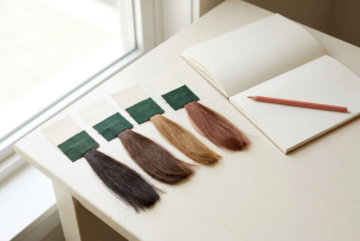
Choose one dominant colour element in your Hanfu portrait, then let fabric, accessories, background and hair share the remaining visual emphasis. Before dyeing, compare a photograph with your existing hair colour against a no-bleach consultation brief; a digital preview cannot establish achievable colour, chemical suitability or historical authenticity.
1. Decide whether you are interpreting a costume or reconstructing it
For an adult costume-photo session, the useful starting question is not “Which hair shade matches Hanfu?” It is “What should this particular portrait communicate?” A contemporary, costume-inspired portrait can prioritise personal expression. A reconstruction brief needs a specified period and evidence for its clothing, accessories and styling. Attractive coordination alone does not make a look historically accurate.
Write one sentence describing the intended image: for example, “A contemporary portrait that gives the embroidered robe priority, without claiming period accuracy.” That sentence prevents later decisions from drifting into unsupported authenticity claims. If historical reconstruction matters, verify the selected references separately; neither this colour worksheet nor a salon consultation supplies that evidence.
FlintHub's Hanfu and traditional costume workshop is a relevant starting point for exploring the costume context. Keep the educational activity distinct from any hair-service enquiry. A workshop link does not establish that colouring, hair preparation or a joint package is included.
In Hong Kong, consider the actual route between preparation and photography. An indoor portrait against a plain backdrop and an outdoor frame beside colourful signage are different composition problems. Pick the setting before treating hair colour as the missing ingredient.
2. Give one element priority with a saturation budget
Saturation describes how vivid or muted a colour appears. It is not the same as brightness: dark red can be strongly saturated, while a pale grey can be bright but muted. Metallic ornaments can attract attention through reflections even when their colour occupies little space.
A saturation budget is a planning device, not a scientific formula. It asks how much competing colour emphasis the frame can carry while keeping the chosen subject readable. Area, contrast, shine and position also affect attention. Do not read the budget as a measured percentage of what viewers will notice.
Use three roles: lead, support and quiet. Assign one lead element in the first draft. A second strong element may work, but should have a clear purpose rather than appear simply because every reference was appealing.
| Element | Possible role | What to check in the actual frame | Reversible adjustment |
|---|---|---|---|
| Fabric | Lead | Does the robe's vivid area outweigh the face? | Change the crop or reveal a quieter inner layer. |
| Accessories | Support | Do reflective pins become isolated bright spots? | Reduce their number or alter their angle. |
| Background | Quiet | Does a coloured wall compete with the sleeves? | Move position or use a neutral backdrop. |
| Hair | Quiet or support | Is its silhouette distinct from the background? | Adjust lighting, arrangement or background tone. |
Start with the largest coloured area, usually the clothing in a full-length frame. For a close portrait, reassess: a small ornament beside the face may become much more prominent. The same person can therefore need different budgets for wide and close compositions without changing their hair between them.
3. Test keeping your existing hair colour first
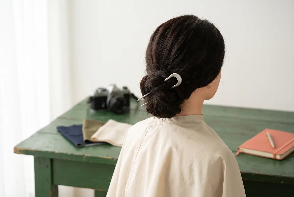
Keeping your current colour is an active design choice. It preserves a familiar appearance after the session and avoids introducing a new colouring process solely for one image. Dark hair can provide a quiet outline beside vivid fabric. Naturally lighter or grey hair can remain part of the portrait rather than being treated as something to conceal.
The limitation is separation. Dark hair may merge with a dark wall; light hair may lose definition against a bright background. First change the background's lightness or the subject's position relative to the light. Those adjustments address visibility without assuming a colour change is necessary.
If hair still needs a deliberate colour role, Vit So's hair colour page offers a service-information starting point. Describe the role you want, such as a subdued supporting tone rather than an attention-grabbing accent. The page cannot establish how that tone will look with your robe, how your existing colour will respond or whether a particular process is suitable. Keep those questions separate from the composition decision.
Compare both choices beyond the photograph. Would you want the proposed shade for ordinary workdays and other clothes? Are you willing to discuss upkeep and later colour changes? When the desired effect exists only in one heavily edited reference, keeping current colour and revising the scene may be the more proportionate option.
4. Separate digital reference conditions from consultation gaps
A colour reference is most useful when it explains a preference rather than demands replication. Mark whether you like its warmth, darkness, vividness or contrast with the fabric. A phone image can suggest those relationships, but its appearance depends on lighting, white balance, editing and display conditions.
Put your own hair, the actual fabric and the ornament in one unfiltered comparison frame under consistent light. Treat it as a communication aid, not a calibrated colour measurement. A second image under the intended portrait lighting can show whether the design changes when the setting changes.
| Reference information | What it helps communicate | What remains unresolved |
|---|---|---|
| Unfiltered photo of current hair | Visible differences between roots and lengths | Full treatment history and chemical suitability |
| Fabric and hair in the same frame | Whether their apparent colours compete | Exact real-world colour under every light |
| Edited colour preview | A preferred warm, cool, vivid or muted direction | Achievability on the existing hair base |
| Costume mood image | Intended atmosphere and ornament placement | Period accuracy and evidence for reconstruction |
| Proposed no-bleach example | A direction to discuss | Product choice, outcome range and suitability |
Avoid sampling a screen colour and treating its digital code as a salon instruction. A flat coloured patch does not contain the hair's varying tones, surface reflections or previous processing. Ask which parts of the reference are realistic and which need revision.
Keep two labels on the brief: “visual preference” and “requires assessment.” This lets a photographer discuss composition without appearing to approve a chemical service, and lets a hair professional assess feasibility without being asked to authenticate a costume.
5. Understand what a no-bleach consultation can decide
“No bleach” describes a proposed approach, not a guarantee of an exact shade or an absence of risk. Keeping your current colour and receiving colour without a bleaching step are not equivalent choices. One avoids a new dye application; the other still requires discussion of the actual products, your hair history and your scalp's condition.
Vit So's no bleach hair colour page is relevant when avoiding a bleaching step is part of your brief. Ask what range of depth and tone might be considered with your existing base and previous colour, rather than assuming a vivid digital example is reproducible. State whether avoiding bleach is a firm boundary. If the preferred reference cannot be pursued within that boundary, revising the portrait palette remains a valid outcome.
The FDA advises following dye-label instructions and explains that a reaction can occur despite previous uneventful use. It also notes that a preliminary skin test does not guarantee there will be no reaction during dyeing. These are general precautions from a US authority, not Hong Kong regulatory rules or approval of a particular salon.1
Record previous colouring, bleaching, perming or straightening as accurately as you can, including uncertainties. Mention earlier reactions and current irritation. Do not use a shoot deadline to override product instructions or assessment. Seek healthcare advice for reactions; this worksheet cannot diagnose a sensitive scalp or establish a universal safe waiting interval.
6. Apply the worksheet to a hypothetical red-robe portrait
The following is a hypothetical exercise, not a client case or tested result. An adult participant plans a contemporary Hanfu-inspired portrait with a vivid red outer robe, cream inner layer, small gold pin and existing dark brown hair. A saved image shows bright copper hair against a green wall.
The participant wants the robe to lead, but the saved image has several strong competing elements. Copying all of them would not necessarily preserve the reference's atmosphere because the participant's lighting, fabric and framing differ. The worksheet should identify what can change before any hair-service decision.
- Write the purpose. “A contemporary costume portrait with the red robe as the colour lead and no claim of historical reconstruction.” Record both a full-length frame and a shoulder-level portrait as intended outputs.
- Assign the roles. Give the robe the lead role, the cream layer and gold pin supporting roles, and the background and hair quiet roles. These are preferences, not attention scores.
- Make a current-colour baseline. Photograph the outfit with existing hair against a neutral grey background. Keep the light and camera position consistent when comparing variants.
- Change one reversible element. Compare the grey backdrop with the green wall while leaving everything else unchanged. If green competes with red, changing the setting may solve the problem more directly than dyeing hair.
- Write a conditional colour brief. “Only explore a muted warm direction if it suits assessment, can respect my no-bleach boundary and is something I want after the shoot.” Add that retaining existing colour is acceptable.
- Define the fallback. Keep current hair, reduce reflections from the pin and adjust the background tone if the hair outline is unclear. Do not escalate to a chemical change merely because the preview was exciting.
The tradeoff is specific. Muted hair and a plain background give up some of the saved image's dramatic colour contrast, but make the robe easier to prioritise. If the participant instead wants hair to lead, the budget should change openly: choose quieter fabric framing and accessories rather than keep calling the robe dominant.
Save the preferred comparison frame and one sentence explaining why it was chosen. That small record is more useful at handoff than a folder of images whose strongest features contradict each other.
7. Hand over a brief that survives the shoot day
Give the photographer the intended lead element, actual fabric reference, preferred background and acceptable fallback. FlintHub's Photography and image workshop is relevant to learning how framing and lighting change an image. Photographic decisions can improve the portrait, but cannot determine chemical suitability.
If you choose to enquire about a service, use the hair colour consultation booking route to ask about arrangements and assessment. Send your colour history, no-bleach boundary, costume reference and shoot date, then confirm availability, consultation language and service scope. An English website does not prove English-language consultation. Do not assume that booking includes costume styling or that timing can fit the portrait schedule; keep the existing-colour fallback available until arrangements are confirmed.
Consider physical comfort as well as colour. A tightly pulled arrangement or repeated hot-tool adjustments should not become the price of a quiet silhouette. The American Academy of Dermatology recommends looser arrangements, gentle handling and lower or less frequent heat to reduce damage.2 For the portrait, simplify an uncomfortable arrangement rather than pulling harder to support ornaments. Non-chemical styling is an alternative, not a promise of zero risk.
Finish with a final-frame check: is the intended lead still clear, can the hair outline be seen, and is the participant comfortable? If yes, stop adding interventions. The aim is a coherent portrait, not the maximum number of changes.
FAQ
Must I dye my hair to make a Hanfu portrait look coordinated?
No. Start with the actual outfit and your existing colour. Background tone, ornament placement and framing can resolve competing emphasis. Dyeing becomes a separate personal decision if you also want the change beyond the photo session.
Does dark natural hair make the costume historically accurate?
No. Hair colour alone cannot establish historical authenticity. A reconstruction claim needs a defined context and evidence for the overall look. A contemporary costume-inspired portrait should be described honestly as an interpretation.
Can an AI colour preview tell me which no-bleach shade is achievable?
No. It can communicate a visual preference, but does not assess your hair base, previous processing or product response. Label the preview as a concept and ask for an achievable direction rather than an exact match.
What if a no-bleach consultation cannot support my preferred colour?
Keep the boundary and revise the visual plan. Try current hair against a different background or reduce accessory colour. You do not need to accept a bleaching step to complete a successful portrait.
How do I use one budget for full-length and close portraits?
Keep the same overall intention but check each crop separately. Fabric occupies less of a close frame, while hair and ornaments occupy more. Adjust framing or ornament visibility before assuming the hair needs changing.
What should I do if my scalp is irritated before the session?
Do not treat irritation as a styling inconvenience to cover up. The FDA advises against dyeing an irritated or damaged scalp.1 Discuss postponing chemical work and seek appropriate healthcare advice for symptoms or a previous reaction; the portrait worksheet is not a medical assessment.
About the author and editorial disclosure: FlintHub Academy publishes creative-learning guidance for its readers. This article was prepared with AI-assisted organisation and institutional editing. FlintHub Academy and Vit So share common ownership; the links are not independent endorsements. This is not a hairstylist-authored review, an expert-reviewed assessment or medical advice. The planned illustrations are editorial concepts, not Vit So work, client cases or historically verified reconstructions.
References
- [1] FDA — Hair Dyes
- [2] American Academy of Dermatology — 10 hair care habits that can damage your hair
FlintHub Academy · AI-assisted editorial prepared from public information. FlintHub publishes creative-learning and activity-planning resources. This is not a first-hand salon test, a real client case or a claim of hairdressing, clinical or medical credentials.